Creative Direction
Product design
Design Lead
Overview
My role involved
- User experience design
- User interface design
- Prototyping
- Creative Direction
- Client presentation
- User testing data interpretation
Objective
To increase productivity, delivering work-life balance for service employees through powerful insights and self-serve solutions.
Solution
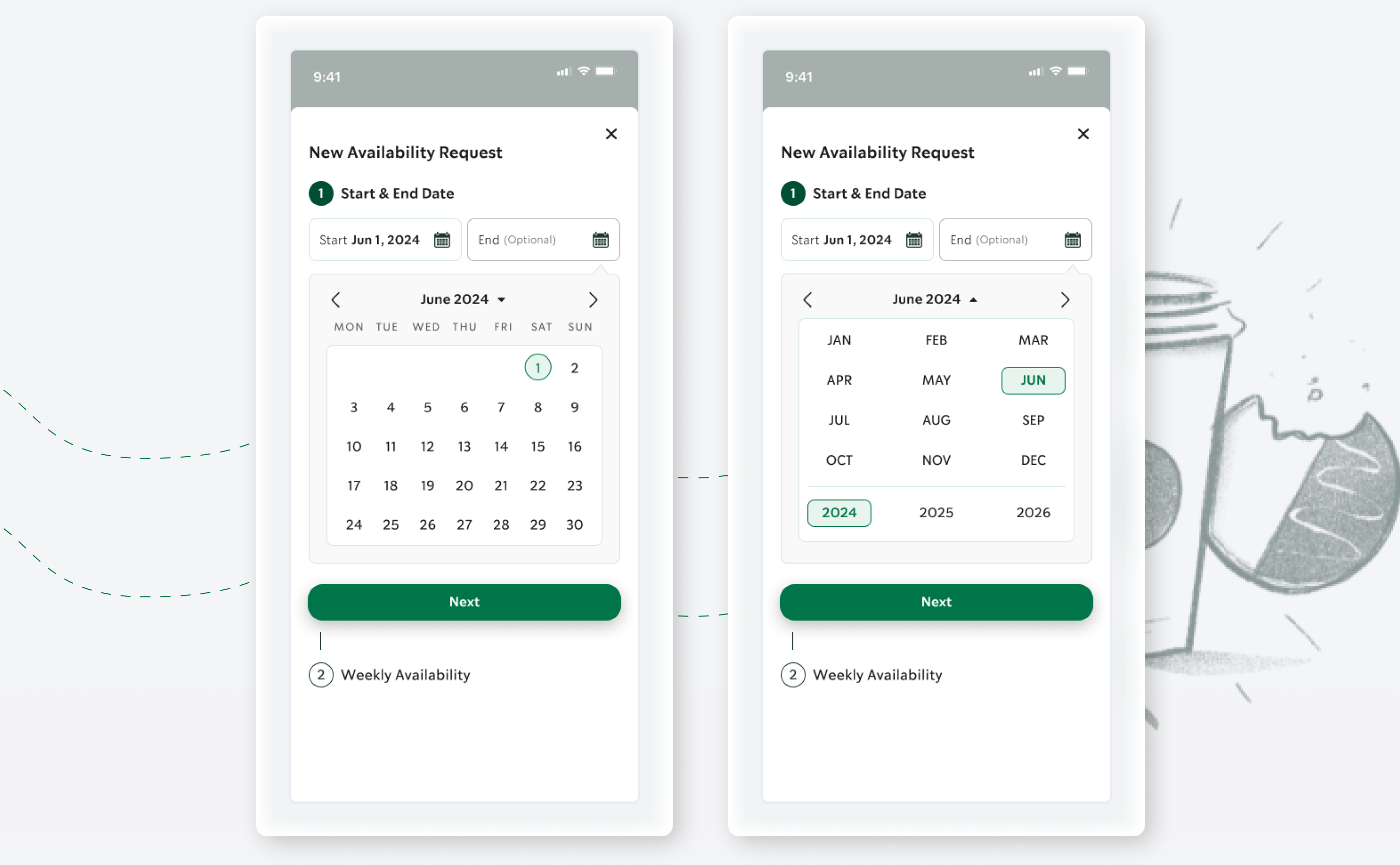
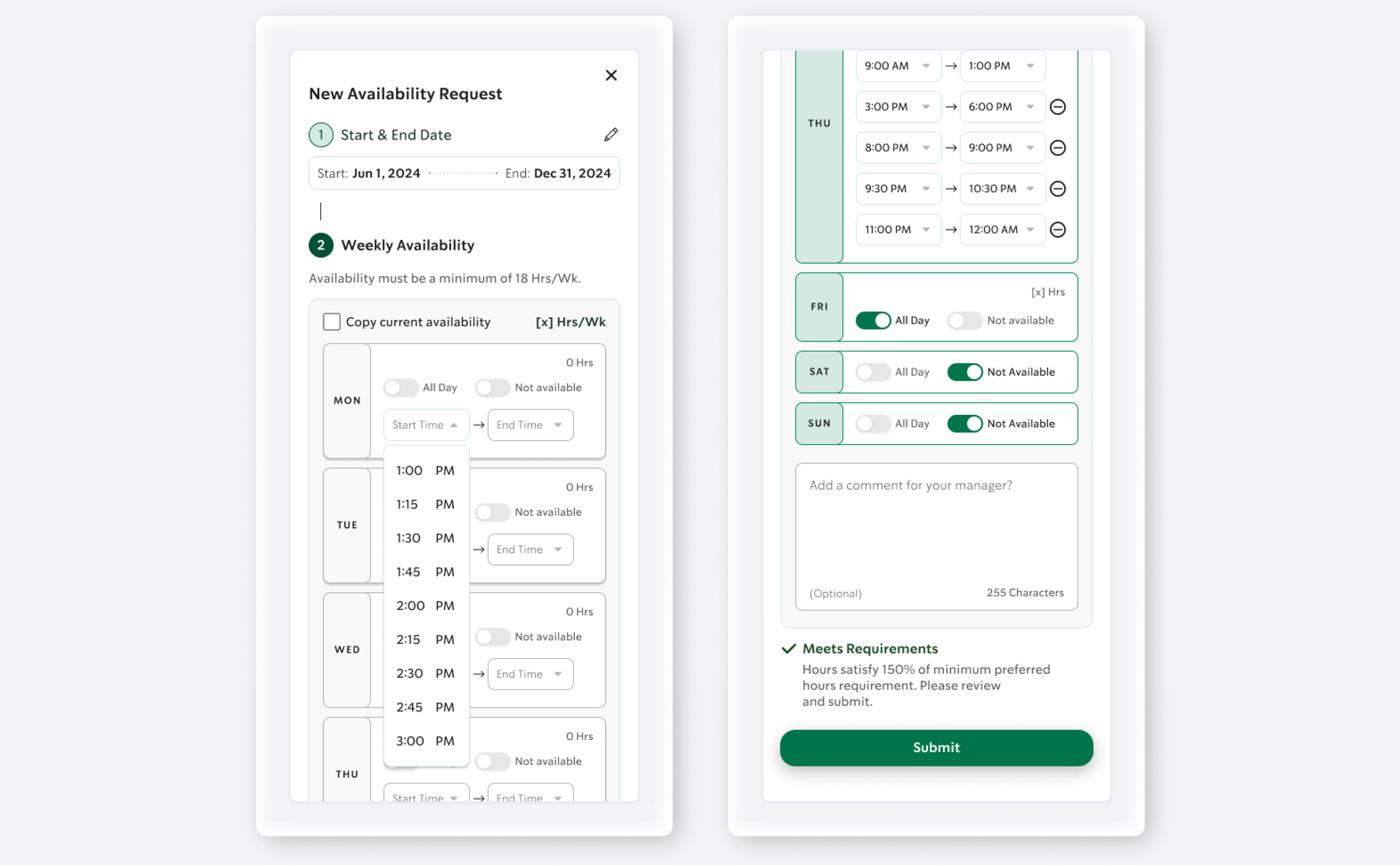
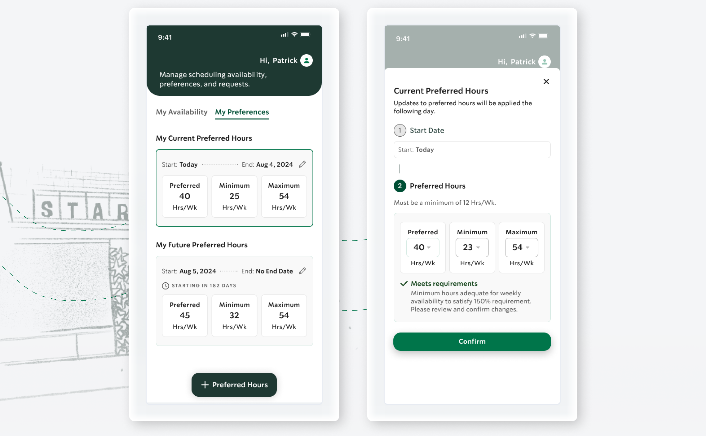
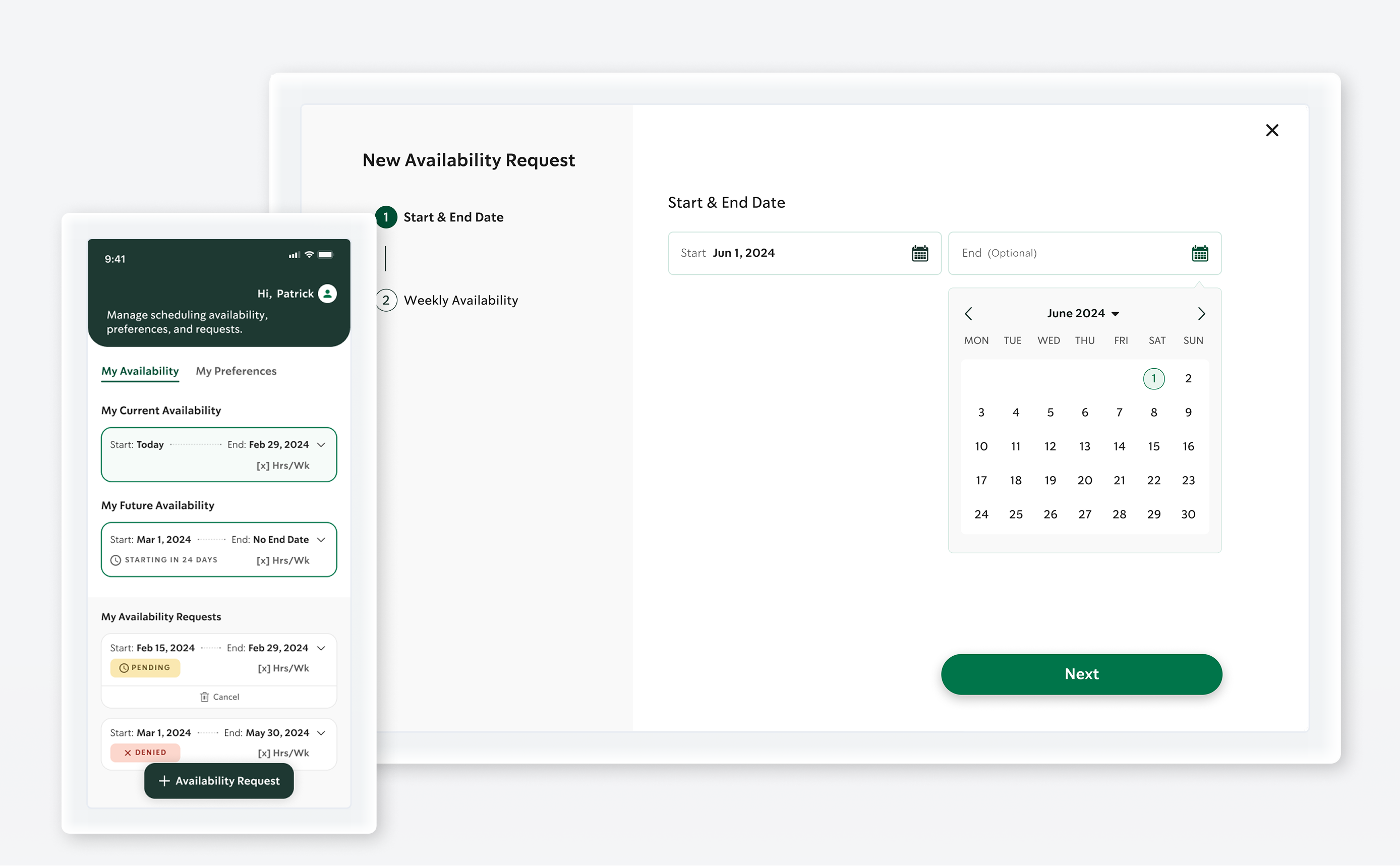
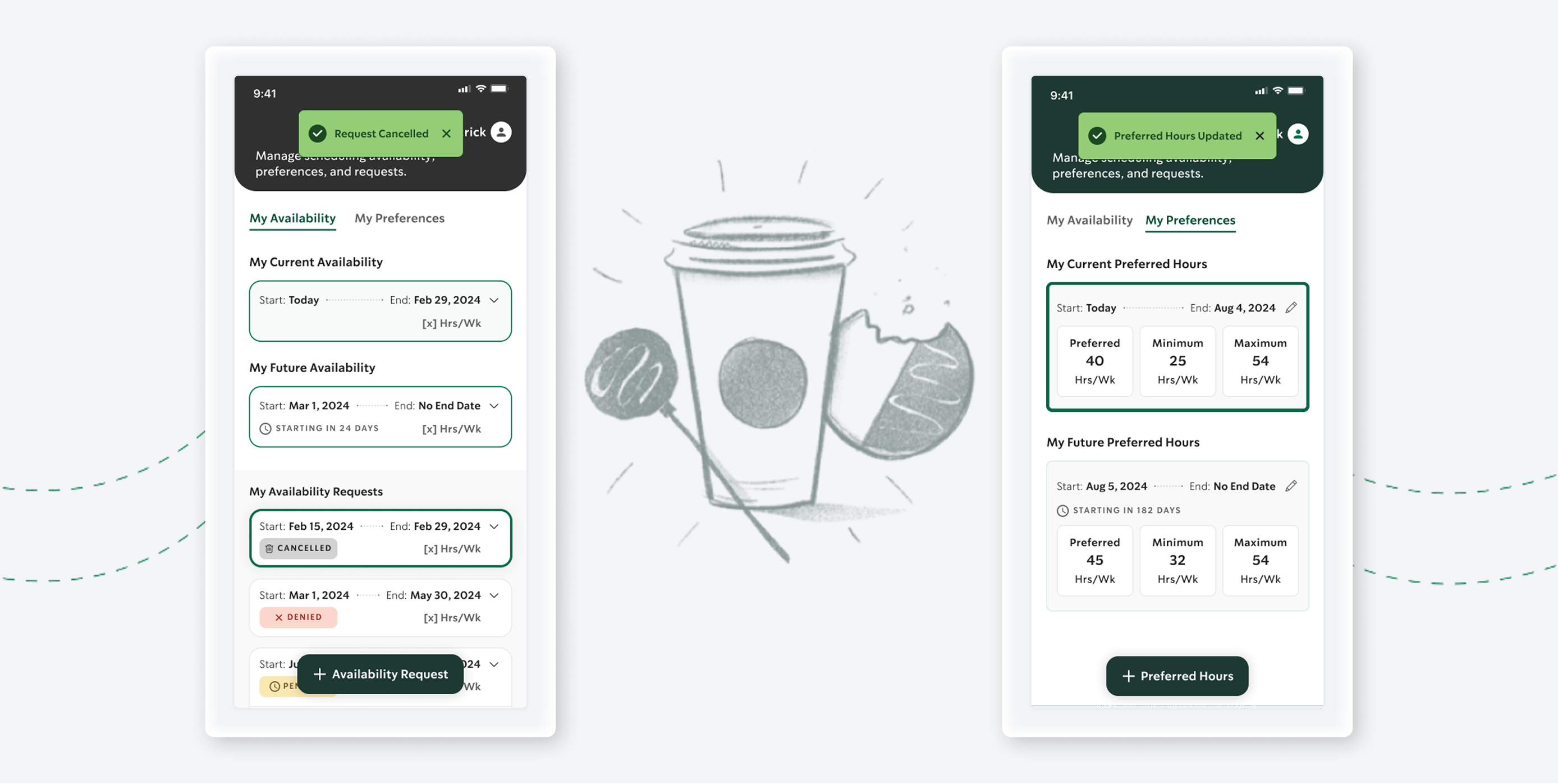
A mobile-first service employee experience, this product consolidates multiple previously used methods, to manage employee preferences and scheduling, into a single, efficient workflow. This streamlines scheduling, using techniques to increase data input quality. Accommodates employee preferences, by empowering employee’s with greater control and insights for balancing work and life commitments. In turn this approach also delivers accurate and timely employee scheduling data to managers.
The product prioritizes employee-centric advocacy, offering empathetic support for scheduling challenges, and delivers work-life balance insights that help employees make informed decisions about their shifts, boosting productivity and satisfaction.
Project Manager, CX Researcher & strategist, Lead designer (me), three designers.
What
I achieved
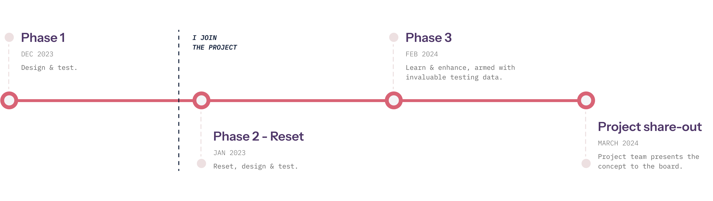
An internal initiative, the product objective was to enhance the employee experience while achieving accurate input data in a consolidated solution. As the project timeline was very tight, we worked in short monthly spurts for discovery, design, test and then reiteration based on findings. I was brought into the project as the lead designer after some mixed initial testing results to bring the project on track.
Ease of use, efficiency and accuracy while delivering clean data for both employee and managers was a key objective for me and shaped the end result. The product combined preferences and scheduling, which were essentially linked, and in-turn served to achieve a consolidated experience for managers too. To get the project on track, I analyzed what we had, plus the data from the first test round, and with some incremental changes, identified ways to effectively and efficiently achieve what users wanted while ensuing a high quality of input data.
How I achieved it
Reset
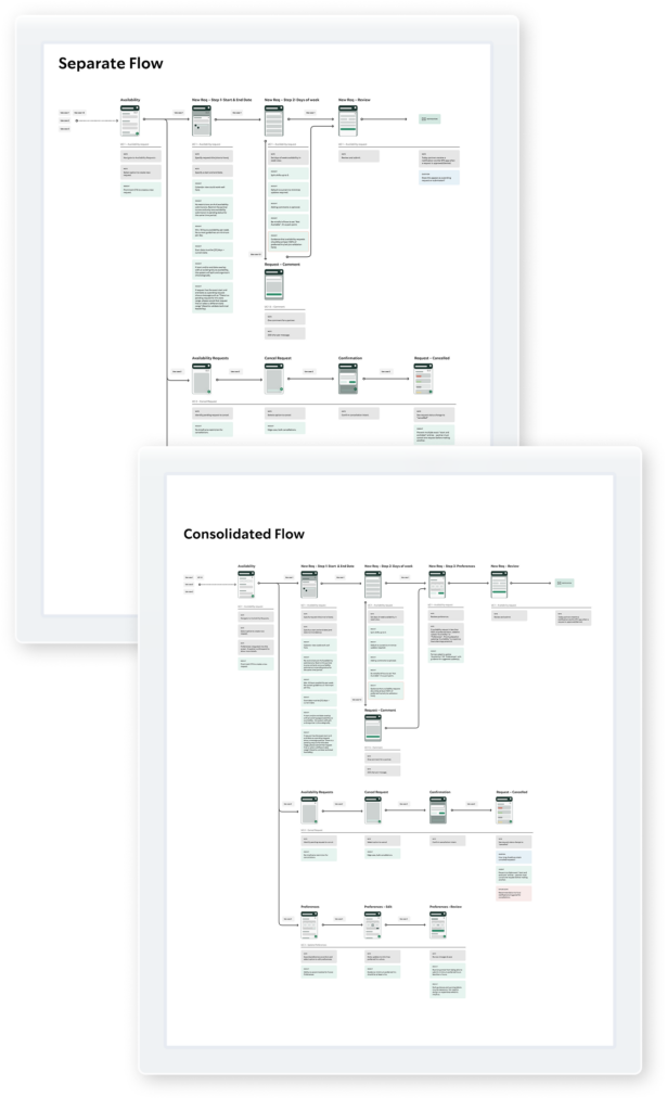
Coming in to an project in-flight, I immediately identified 2 methodologies to help us achieve better results:
- • USER FLOWS: I got the team to put together user flows, to streamline the experience. We fleshed out 2 flows that achieved the objective. I presented these to the stakeholders, while giving clear rationale for the consolidated flow would work best for ensuring a higher quality data.
- • WIREFRAMES: I got the team to go back to a wireframes stage, this was a step that was missed and I wanted the team to focus on functionality to achieve the key objectives (user and business), before focusing on HiFi designs.
Discovery and experience
I crafted the mobile experience first, focusing on key user feedback at incremental points, so the user always was informed and confident in the process. I met with the team regularly to ensure we were on-track. When the mobile experience was solidified, the team flowed this out. I found learnings from each viewport, and consolidated to get the best outcomes for the overall experience. I got the team to use components and styles so that when we moving to visual design, the transition was very efficient.
As this was a net new internal project, we did not use the Starbucks consumer facing design system. I had a somewhat, open book, while still adhering to the core branding. The Starbucks product team supplied some examples for inspiration and we conducted some research of our own. I set about putting a StyleGuide in place, consulting with our Starbucks brand point of contact. When we had some key screens in the visual design, we presented to the client to get confirmation before flowing the approach to the rest of the screens. Updating styles and components, made the transition to visual design very efficient.
Enhancing
Through the design phases, I compiled a list of assumptions which fed into our user testing rounds. Each round of testing required fewer enhances. With some addressable pain points after the final round of testing we got answers to key questions to make informed decisions and eliminate those pain points. With some enhancements, we delivered a user-centric product that the Starbucks Project Manager was very excited to share with his stakeholders. The results were impressive.
a task.
“This is absolutely amazing.”
“I’m a little flushed and kind of hot and bothered over it in fact, I mean this is really really fantastic work. I think this is such a game changer for both our hourly partners and for our store managers and the the quality, the progress, the thought that's gone into this to date. I’m just blown away by it. This is the best meeting in the day for me.”
Micke Ochs – VP Partner Centric Scheduling, Starbucks